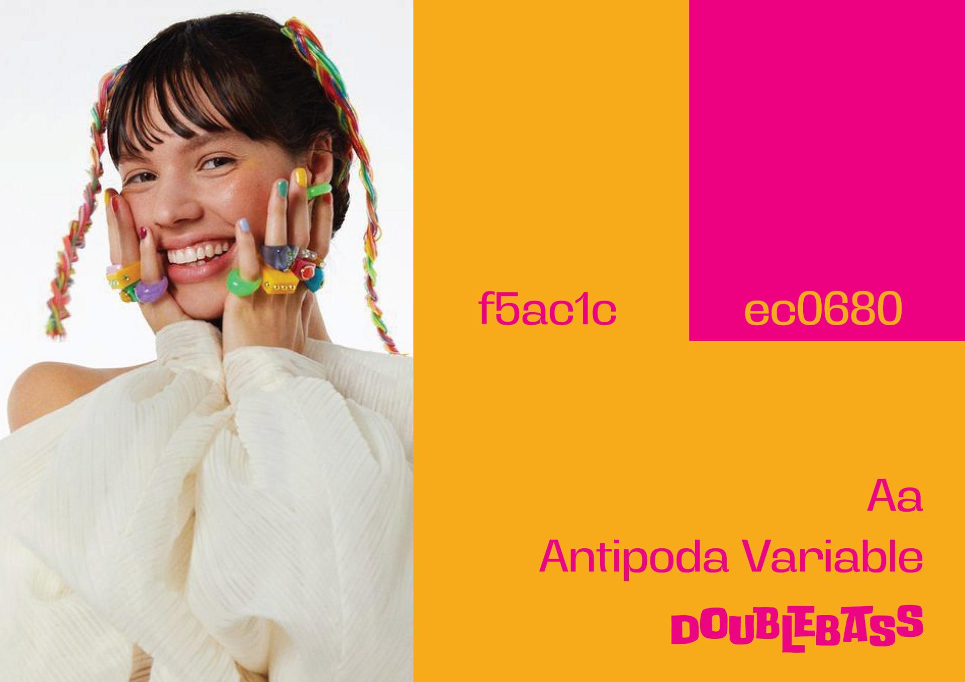
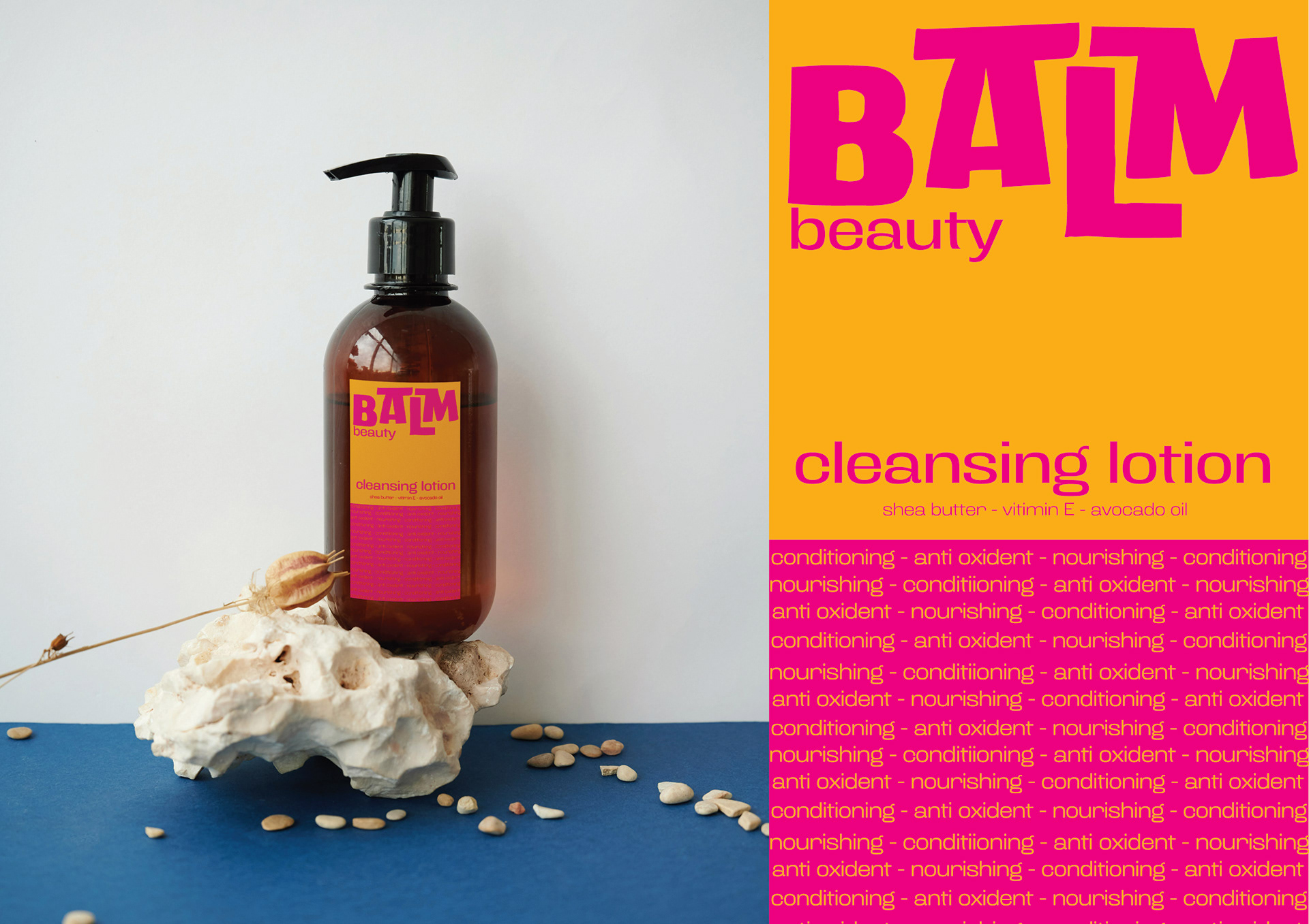

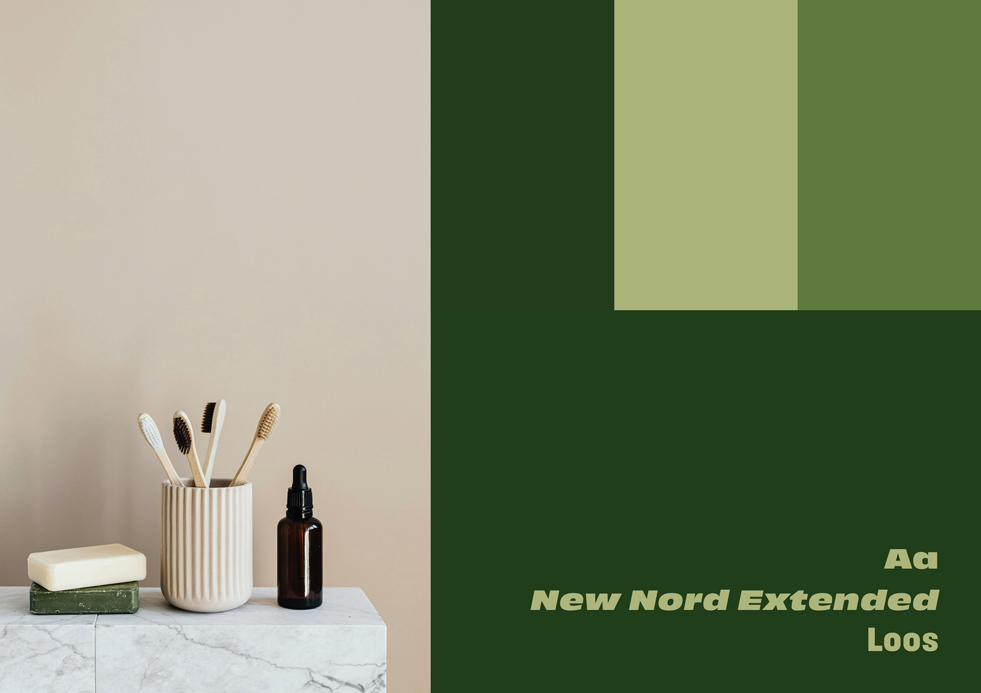
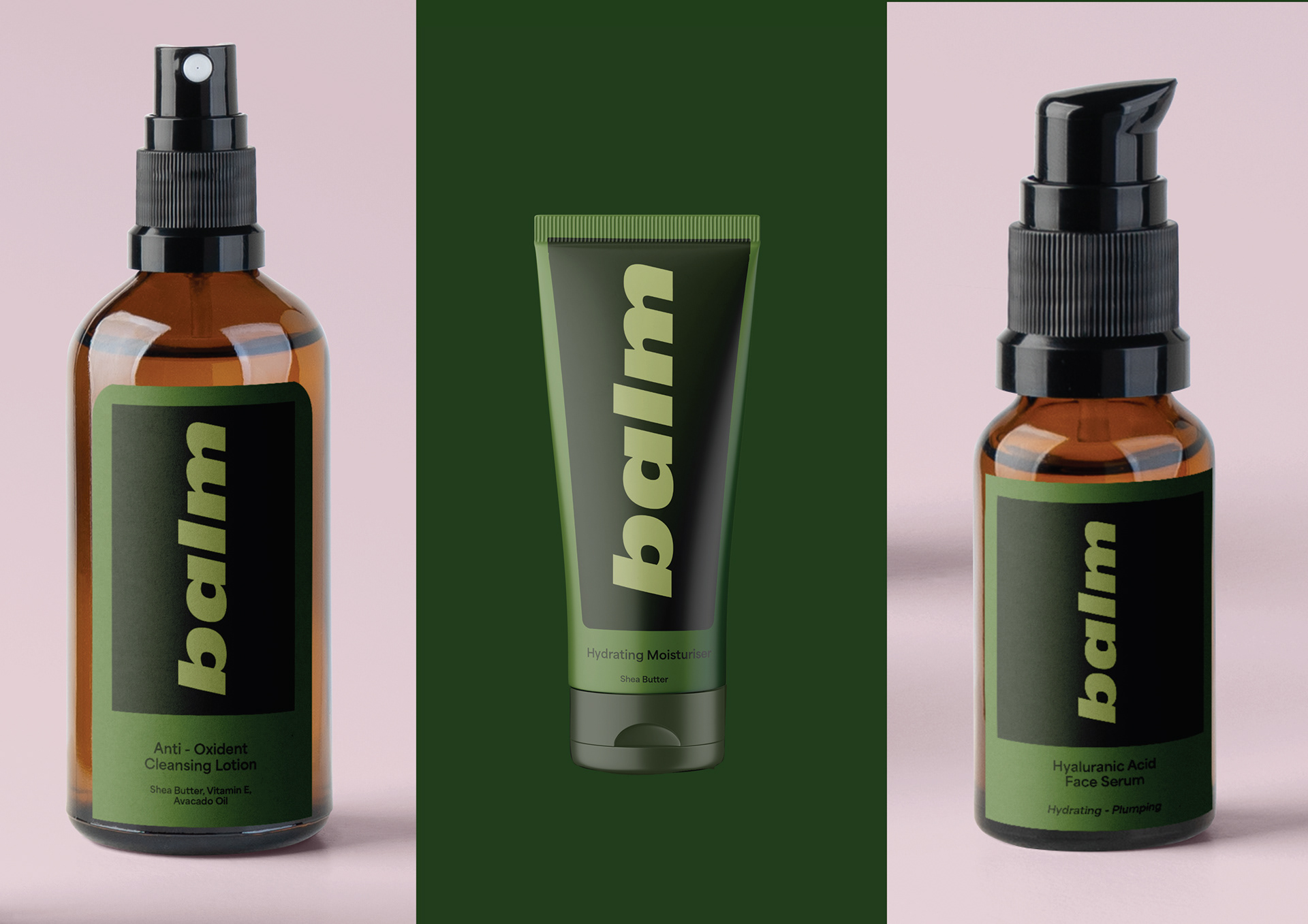

I have made 2 different options for a new cosmetics brand. The first has a younger target audience in mind. It uses a saturated colour scheme with big fonts to give it a playful touch. The second option attempts to reach out to the millennial demographic. This design uses darker colours that could potentially be perceived as masculine. I used these because as a beauty care customer myself I don't often find myself reaching for pink 'girly' products. I often find more mature, musky colours can give the feel of luxury and quality.